Buddle Venues
Client: Buddle Venues
Project: Brand Identity
Year: 2020
Across the UK there are thousands of community activities looking for a place to call home. That's where Buddle Venues steps in. We worked with them to define their brand identity.

The Buddle colours are simple. Just like the service.
Blue
Yellow
Dark Purple
Red
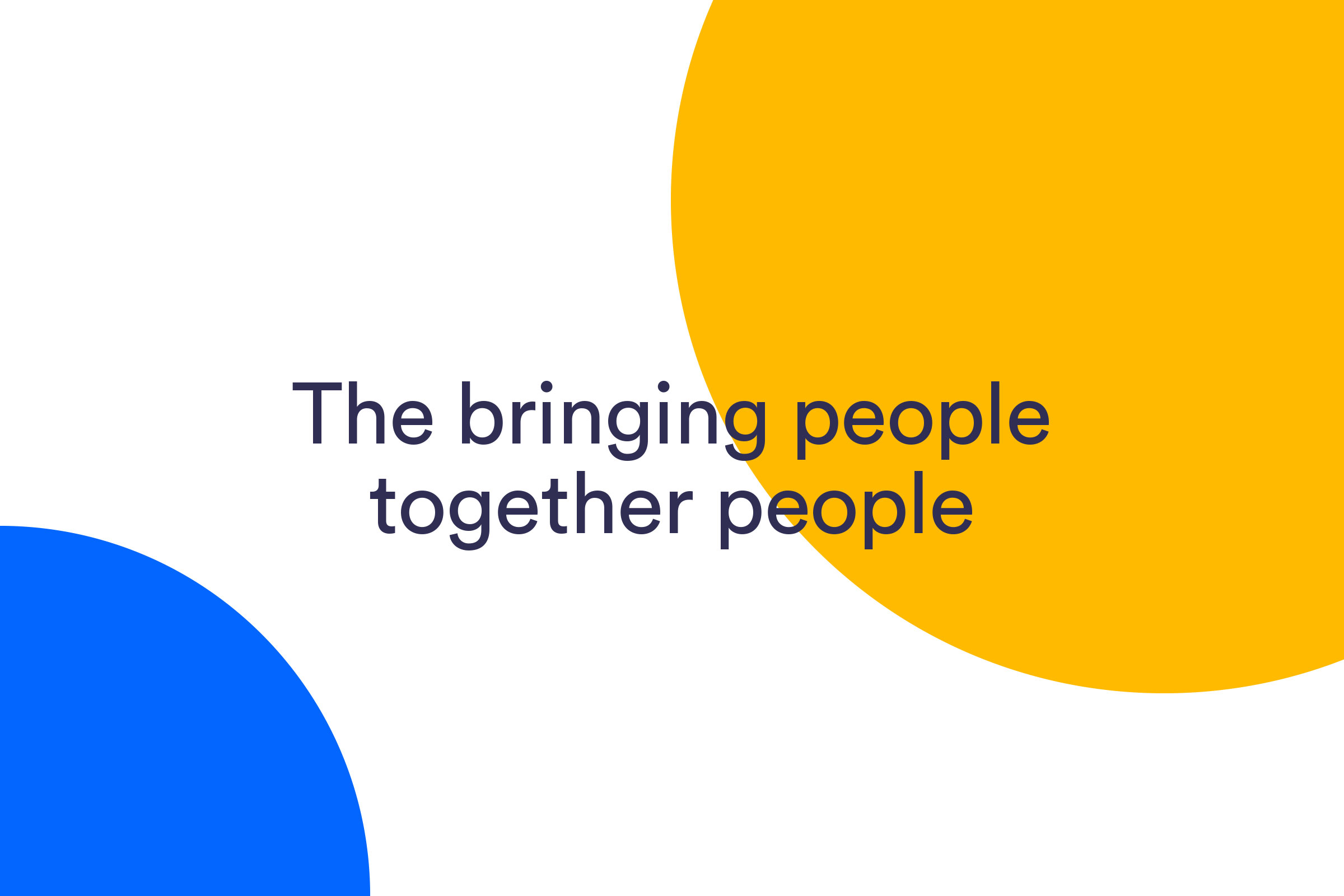
A simple proposition. The bringing people together people.
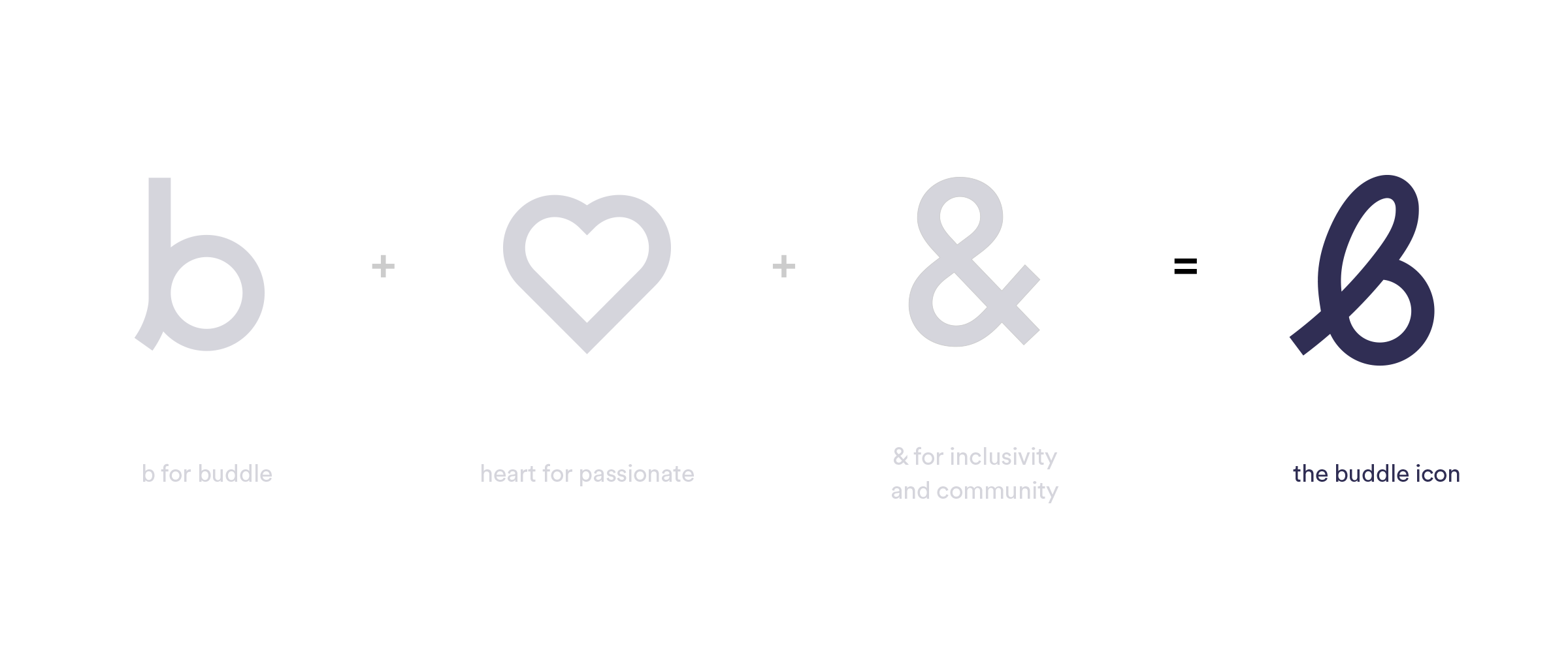
We developed a range of icons for use on the website and across marketing materials. The icons follow the same weight and continuous style as the logomark.
The brand identity is made up of elementary shapes which form to create graphical devices. This pattern is inspired by different types of people coming together to form something special.
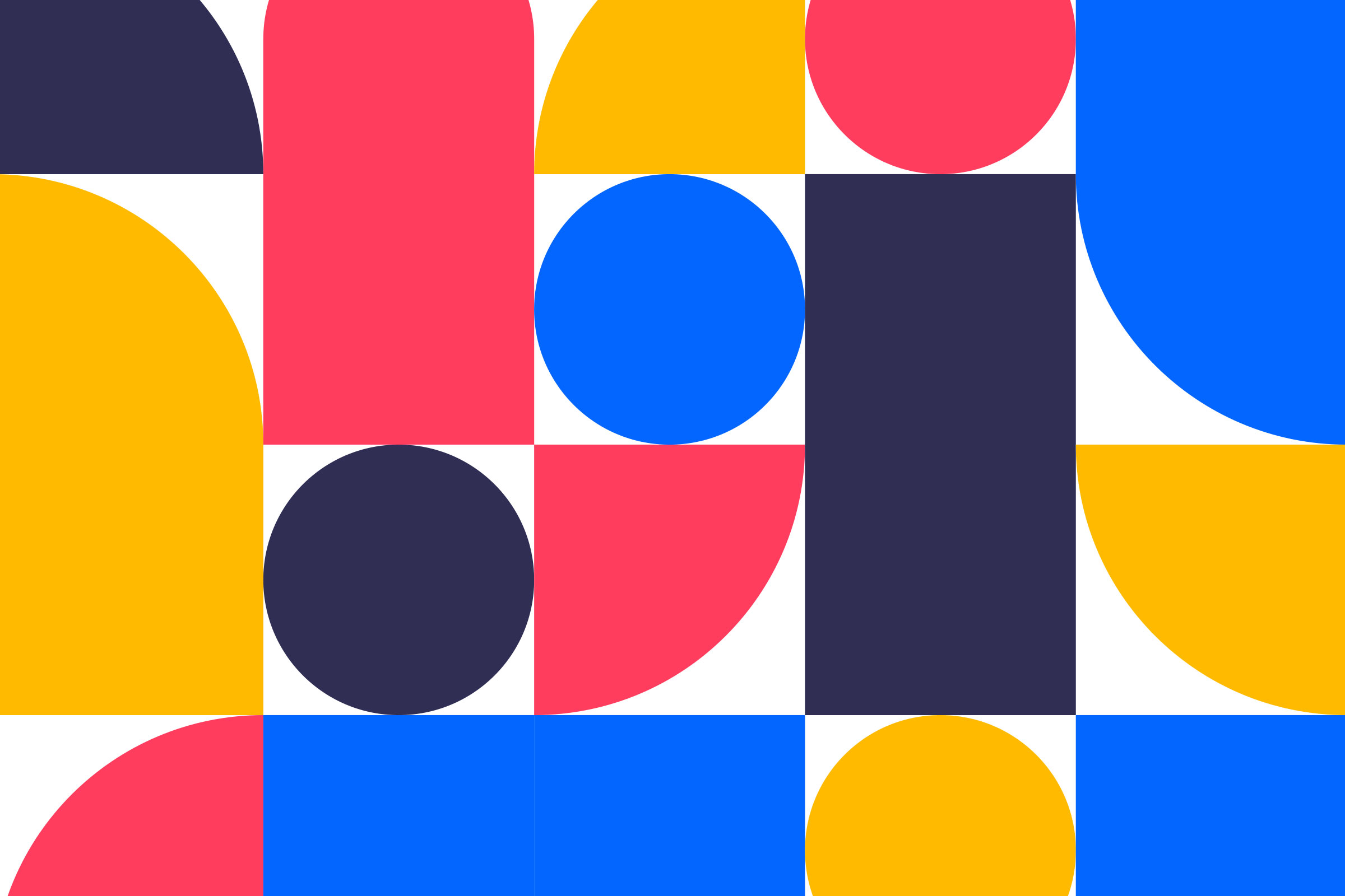
An example of how these shapes form to create impactful numbers.



The social style is fun and incorporates the elementary shapes to bring the messaging to life.
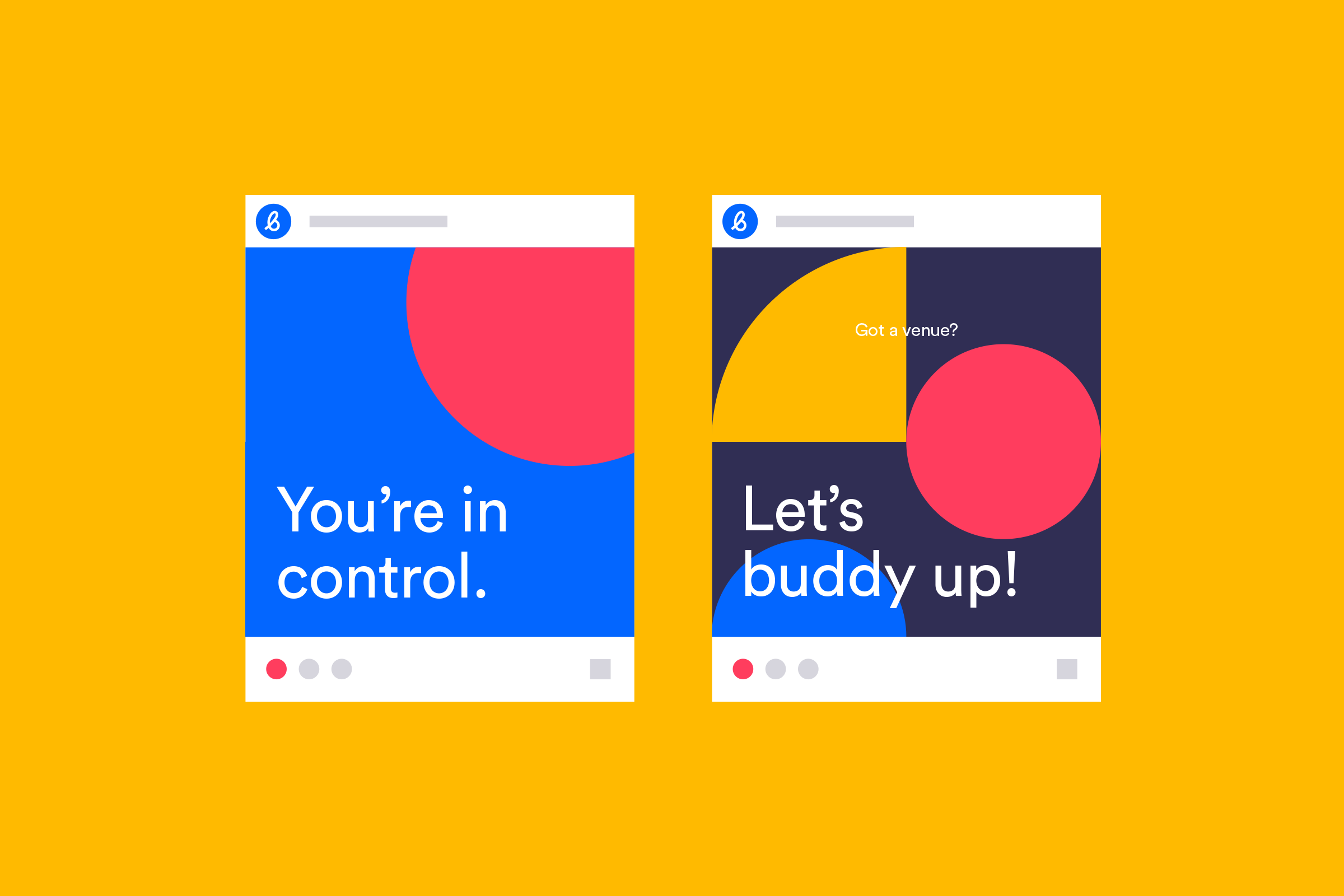
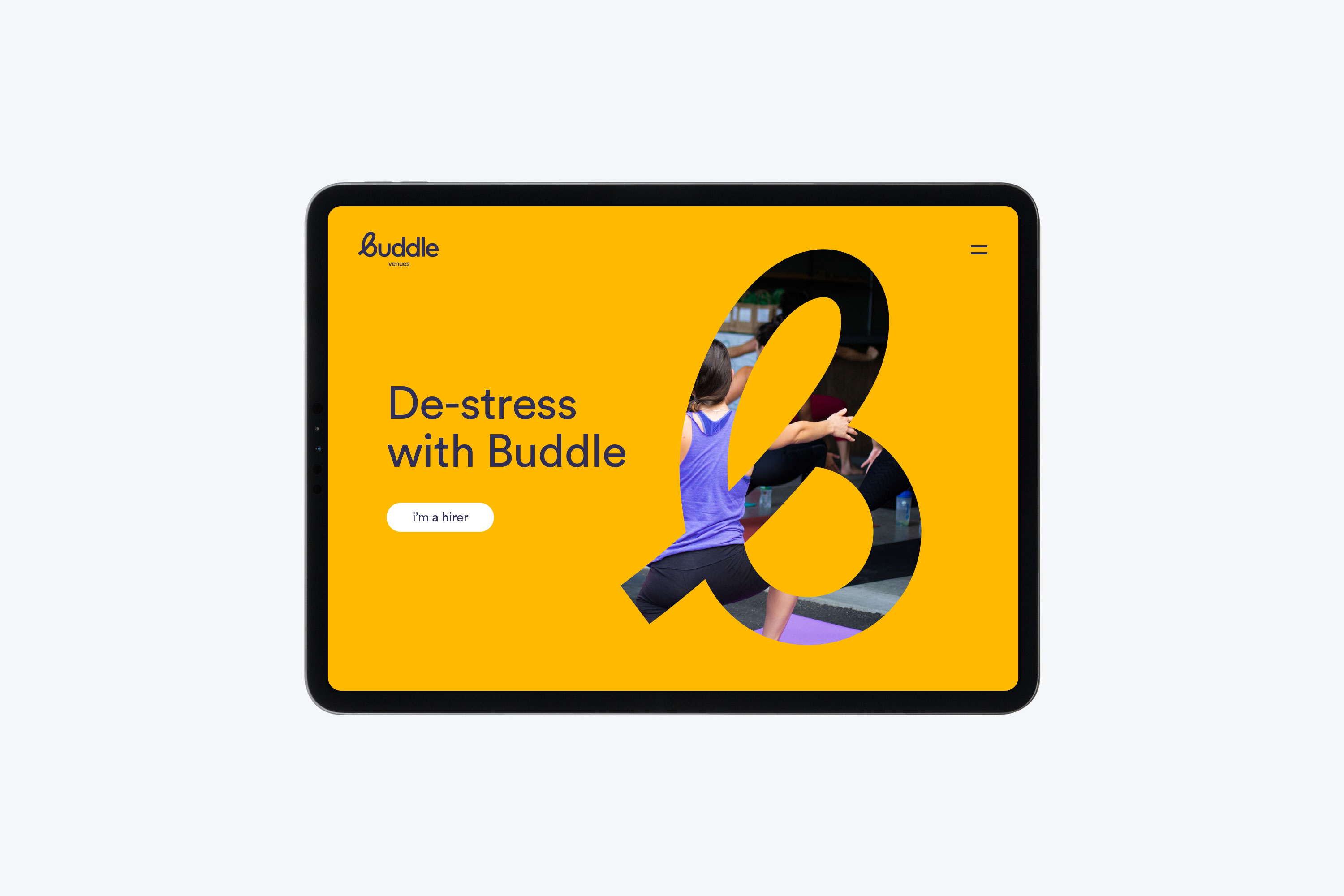
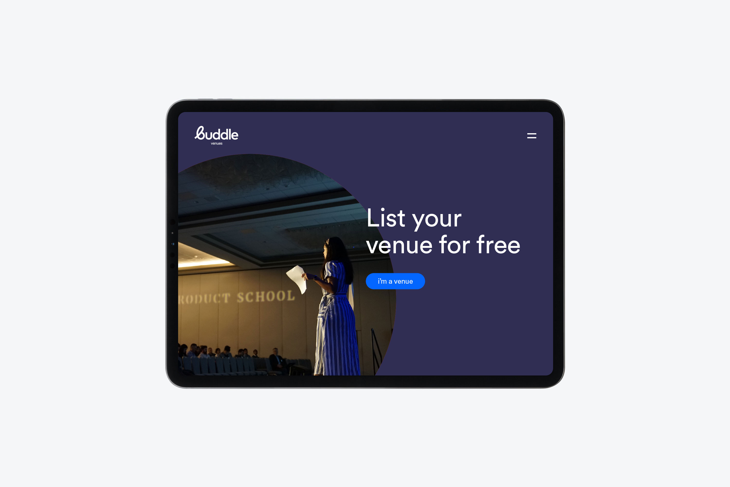
Bringing the brand to life online.
